LinkBack URL
 About LinkBacks
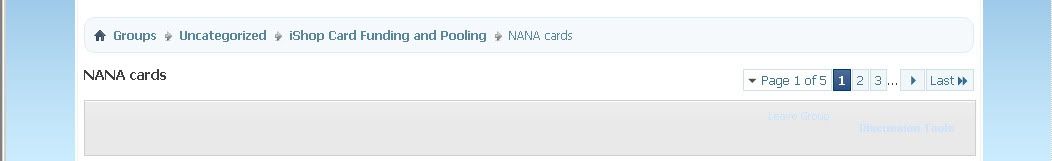
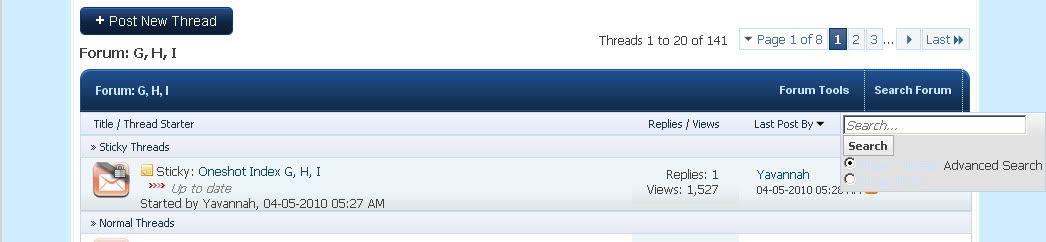
There are a few things that are difficult to read while using the Fantasy Blue theme.
1. Discussion Tools and Leave Group option in Social Groups. The pale blue text on the gray background is very difficult to read/see.
2. Search Forum function options. Again the pale blue text on the gray background is very difficult to read/see.
3. The bright, blinding white background for where we read posts is very harsh on the eyes. If you could perhaps switch the background color that you have where the avatar is with where we read text, it would be an improvement. Actually, pretty much anything would be an improvement over the bright white.
Register Member login

Results 1 to 10 of 19
- 02-17-2011, 01:15 PM #1Halite75Guest
Difficult things to read in Fantasy Blue
- 02-17-2011, 08:21 PM #2Aarin - Busy


- Join Date
- Feb 2005
- Location
- Malaysia
- Posts
- 7,863
- Points
- 93,204,993,000
- Savings
- 8,500,000


Yeah, noted about the light blue text, it's something that has to go.
As for the Fantasy Blue one, well... maybe another theme that may have gray background.
- 02-17-2011, 11:34 PM #3Extreme Yaoi Guru

- Join Date
- Jan 2006
- Location
- Thessia
- Posts
- 6,143
- Points
- 56,460,550
- Savings
- 63,231,351


And in Fictions, you can't really see the "Entry options" when you're perusing an individual story.
I actually don't mind the white background to Blue Fantasy at all.
- 02-18-2011, 01:05 AM #4Halite75Guest
Oh, another difficult thing to read is the time stamp when you are reading a Private Message. The time stamp is written in white on a light blue background, which makes it almost impossible to see.
- 02-18-2011, 02:01 AM #5
Personally, the white background makes it easier for me to read everything. That's why I use the Blue theme. For me, anything written in red in Fantasy Black is blinding actually.
- 02-18-2011, 02:10 AM #6Aarin - Busy
- Join Date
- Feb 2005
- Location
- Malaysia
- Posts
- 7,863
- Points
- 93,204,993,000
- Savings
- 8,500,000
Everyone has their own preferences especially the white and black background.
Take me and Dai-kun for example.... he uses his pc in a very dark room and me in a very bright room. He likes to use the black theme while I like to use the white background because I can't read much on the black background especially with dark text on it due to the bright light here.
Anyway, I know kriska22 is working on a different theme... so let's see if she can get something out. It's the green theme and follows a bit of the old green one, so I think it has a gray background.
-
5 Users Say Thank You to aarinfantasy:
- 02-18-2011, 01:38 PM #7Halite75Guest
The white is too light for me and the black is too dark for me, but the white is the lesser of the two evils b/c I too am in a bright room. I certainly am hoping for something in the middle for the next theme for the sake of my poor old eyes.

Example:

- 02-19-2011, 01:06 AM #8Aarin - Busy
- Join Date
- Feb 2005
- Location
- Malaysia
- Posts
- 7,863
- Points
- 93,204,993,000
- Savings
- 8,500,000
haha yes noted ^_^ Originally Posted by Halite75
I seen that tone chart before posted here~
- 02-19-2011, 03:38 AM #9Extreme Yaoi Guru
- Join Date
- Apr 2005
- Location
- in the back seat of the Impala
- Posts
- 4,039
- Points
- 21,412,340
- Savings
- 53,827,892


What's really difficult to read in Blue Fantasy is the What's up box ; ) I use Black Fantasy and white color for text in my profile. In Black Fantasy everything looks ok, but when changed to Blue, whole box looks just empty. It's pure white.
-
User Says Thank You to yina:
- 02-19-2011, 05:58 AM #10tina21Guest
In Dark Fantasy the color in the search box is a very light grey, which in a white background isn't very visible... can that change?


 Posting Permissions
Copyright © 2024 vBulletin Solutions, Inc. All rights reserved.
Live Threads provided by AJAX Threads (Pro) - vBulletin Mods & Addons Copyright © 2024 DragonByte Technologies Ltd.
Shoutbox provided by vBShout (Pro) - vBulletin Mods & Addons Copyright © 2024 DragonByte Technologies Ltd.
All times are GMT -5. The time now is 01:30 AM.